# The Hidden Smile in the Coca-Cola Logo: A Clever Optical Illusion or Just a Coincidence?
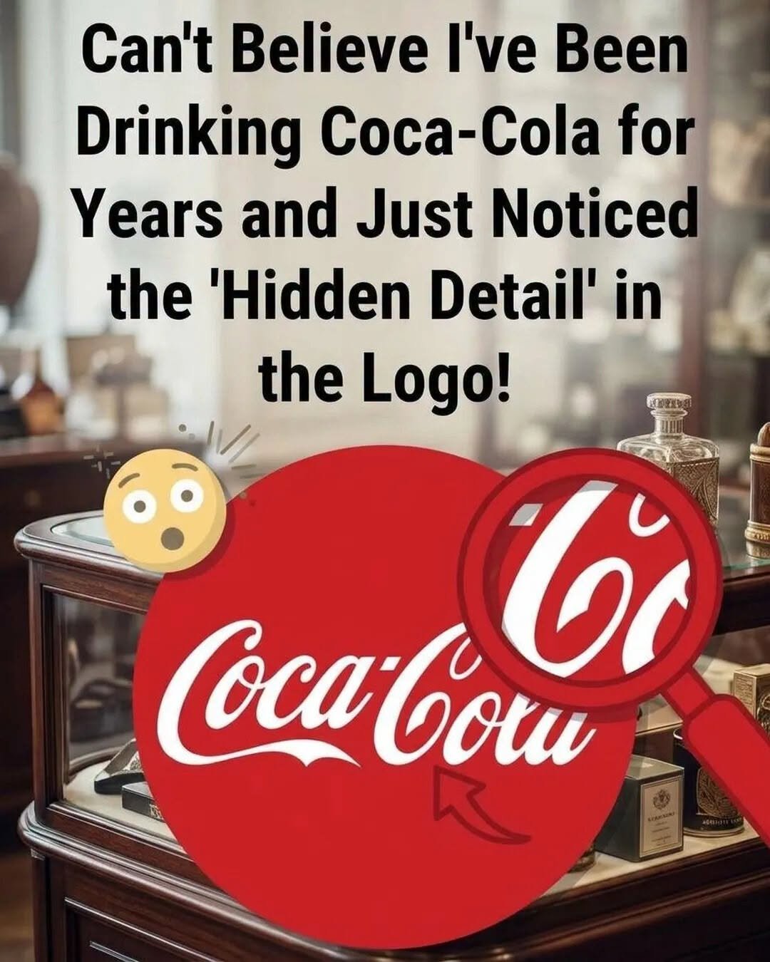
One of the world’s most recognizable brand logos may be hiding a tiny detail that many people have never noticed. For generations, millions of people have seen the familiar Coca-Cola lettering on bottles, cans, advertisements, and restaurant signs. Yet some observers believe there is something unexpected hidden within its famous flowing script: what looks like a small, friendly smile.
The Coca-Cola logo is known for its distinctive Spencerian-style lettering, with elegant curves, sweeping strokes, and connected letters. Its appearance dates back to 1886, when Frank Mason Robinson, the company’s bookkeeper, suggested the name and wrote it in the distinctive script that would eventually become famous worldwide.
Over the years, the lettering became much more than a way to identify a soft drink. It developed into a powerful symbol associated with happiness, celebrations, nostalgia, and shared moments.
The supposed hidden smile has attracted attention because certain curves and connecting strokes can resemble a cheerful facial expression when viewed from a particular angle. Once someone points it out, it can be difficult not to look for it again.
But is the smile actually intentional?
There is an important distinction between an optical illusion and a confirmed design secret. Coca-Cola’s historical logo development is documented, but there is no established evidence that its original designer deliberately incorporated a hidden smile into the lettering.
That doesn’t make the observation any less interesting. Our brains naturally search for familiar patterns, especially faces and expressions. This tendency, known as pareidolia, explains why ordinary shapes, clouds, and even letters can suddenly appear to have eyes, faces, or smiles.
Perhaps that is part of the logo’s lasting fascination: a design created more than a century ago continues to invite people to look closer.
Sometimes, the smallest details are the ones that make an ordinary object feel extraordinary. And the next time you see that familiar red-and-white logo, you might find yourself examining its curves a little more carefully.
Website Disclaimer
The information provided on this website is for general informational and educational purposes only. While we strive to ensure that all content is accurate and up to date, we make no guarantees regarding the completeness, reliability, or accuracy of any information published.
The views and opinions expressed in articles belong to their respective authors and do not necessarily reflect the views of this website. Any action you take based on the information found on this website is strictly at your own risk. We will not be liable for any losses, damages, or inconveniences arising from the use of our content.
Some articles may contain opinions, third-party information, or external links. We do not endorse or guarantee the accuracy of content on external websites and are not responsible for their practices or policies.
All content on this website is provided in good faith and is intended for informational purposes only. Readers are encouraged to verify information independently and seek professional advice where appropriate.